CastInk is a platform that filters based on personal taste; empowering newbies to find the right tattoo artist with clarity and confidence.
CastInk is a platform that filters based on personal taste; empowering newbies to find the right tattoo artist with clarity and confidence.
Role
Castink is a project that I worked on for the Immersion module of the UX Design course I undertook at CareerFoundry. The project brief was to create a responsive application that acts as an image repository for tattoo art, helping users to select art that is right for them. The project was completed in 7 months, and I undertook the role of UX designer, facilitating all interview and testing sessions, analysing research, prototyping and designing the final Ul.

What’s the Problem?
Getting a tattoo in 2021 doesn't have the same type of spontaneity it once had. Partly to the rise of social media and partly to the shifting landscape of trends, it's understandable that you might feel a certain resistance, internally. The problem for most tattoo newbies is that there isn't a comprehensive way to take that initial plunge. A lot of confidence is required to engage in a practice that is so foreign, and so permanent.
Let’s set some targets
The solution to this problem would be to create an application that gives you the ability to quickly narrow down any initial ideas for a tattoo, by displaying designs curated by local artists in an area of your choosing.
Then, the application should direct you to the artist responsible for that artwork so you can discuss the specificities of the design, and discuss your goals in detail.
My high level goals are to:
Make the process of narrowing down a design fast and easy.
Establish a way for users to see what their selected art would look like on their body.
Connect the user to the artist that is right for them.
Asking the people
I began this initial phase by undertaking a Competitive Analysis to understand the strengths and weaknesses of other products or services that currently occupy the market. This was helpful to understand basic information architecture and features specific to each product.
I conducted interviews with 4 participants, each having varying experience with tattoos to garner their insight. My goal was to understand their frustrations with past experiences, but also weigh that against their needs, to better understand the gaps between the two.
All participants shared one common viewpoint which was that finding the right artist is an intimidating and laborious task.
"Finding a tattoo artist was a big challenge for me because I didn't know how to verbally communicate or express myself.”
"Finding a tattoo artist was a big challenge for me because I didn't know how to verbally communicate or express myself.”


There's just too much choice
Part of the frustration participants felt in their experiences of getting their first tattoo was in finding the right artist. When they did decide, the majority of their decision was based on one of two factors; the artist's location or the quality of the their portfolio.
They felt like their realistic options needed to be narrowed down to make their selection process simpler. They didn't want to be told who was "the best artist for them", they feel like they couldn't trust a recommendation from an application.
They wanted to feel like they still had a choice.

Plan of action
Before I begin to design and wireframe, I approach the challenge with a mobile-first design plan, taking consideration of what the interview participants voiced as concerns. It was important for me to define my success criteria with regard to the feature set that would help them better their next tattoo experience.
Previously, their open-ended search methods yielded limited results and took too much time. Even after this process, many of them didn't push forward as they lacked that confidence in their choices.
The time and energy spent trawling through social media and Google Image Search was ultimately preventing them from pulling the trigger. There needed to be a succinct task flow that aligned with their mental model.
"Maybe your phone could take a photo of your body to understand its contours and then plant the image directly on your body”
"Maybe your phone could take a photo of your body to understand its contours and then plant the image directly on your body”
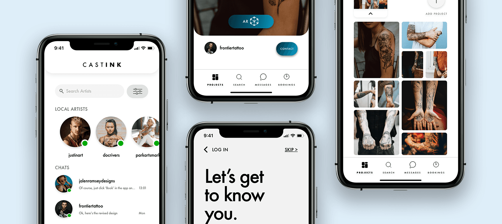
Introducing CastInk
Introducing CastInk
The Final Design
The final design brings together a 7 month journey that went through multiple iterations and testing sessions to bring the complete design thinking process to fruition. The result is a product that follows the idea of tailoring and filtering the experience for action.
There is a directness to the task flow which requires the user answering a few onboarding questions, ultimately resulting in them teaching the application what they like and dislike as per their tastes and their tattoo goals.
From this, the user can visualise clear paths of action that provide them with mental clarity and remove the cognitive load of choice. It's important to also understand that this process is not a final decision made on behalf of the user, but will require the user to take command of their own decision-making and decide on an artist of their own choosing.
The product facilitates the user making the right connection.
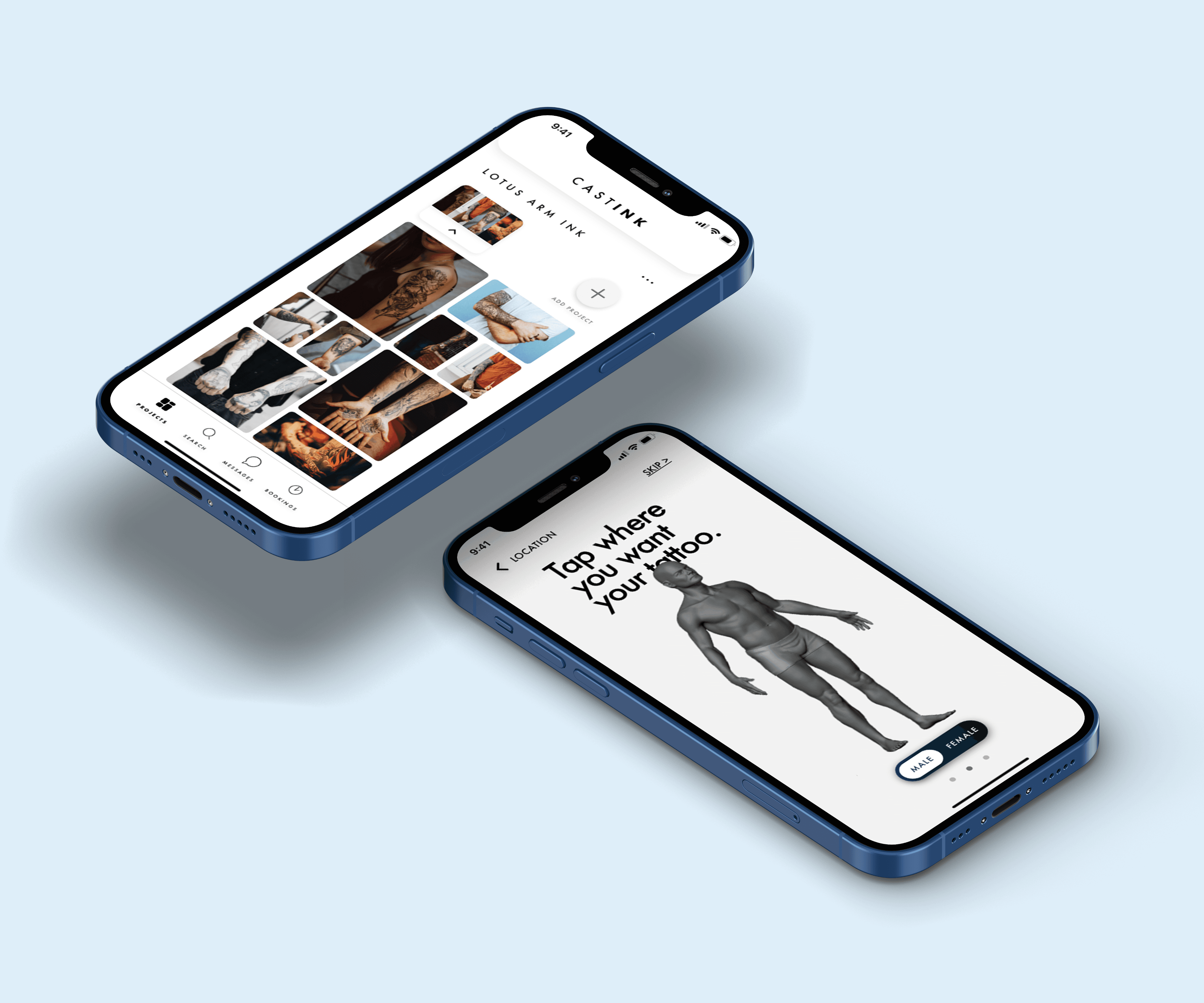
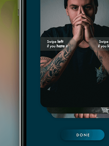
Onboarding
The journey kicks off with just 4 clear and helpful questions. Once that’s complete, the user sees the ‘Curated Gallery’; a screen that reveals suggested designs based on how the questions were answered.
This gives users a good sense of what works for them from the beginning. All of this leads the user to begin forming a choice from a narrow set of strong, relevant designs they’re now ready to take action on..
Projects
After being shown results that reflect the user’s personal answers in the Curated Gallery, the user is able to swipe right to save a design to their new project, or swipe left to move on from it.
Saving designs to their project enables users to build a visual collection they can return to and evaluate later. As they continue to refine the list, the system works to customise the entire experience for quick action.
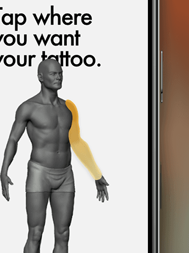
AR Camera
Once users view designs that fit their earlier input in the Curated Gallery, they can use swiping gestures (right to save, left to skip) and begin forming their visual list.
By saving designs into a project, users build a personalised shortlist that evolves as they explore. This active filtering helps shape the design journey.
Messages
After the app supports users in narrowing their choices and they pick a favorite design, it helps them reach out and start the process with the most suitable artist.
They can message the artist directly via the image’s detail screen or once they’ve previewed the design using the AR Camera tool.
How the sausage gets made
How the sausage gets made
The Process
The design thinking process was followed very closely in fleshing out my strategy moving forward. A lot of prototyping, testing and iteration allowed me to figure out the best method to simplify and clarify the user journey.
A few questions informed my design strategy:
How can the user find the right artist for them?
What criteria will give the user confidence to follow through with getting a tattoo?
How important are the opinions of friends and family when deciding on a design?
What does a positive tattoo experience look like?
Competitor Analysis
Early on, it was important to understand what the tattoo experience looks like through the context of other products or services currently available on the market. I conducted a Competitive Analysis to better understand the features that they offered, and their strengths and weaknesses.
The analysis of two products (InkSquad & Ink Hunter) gave me clarity as to what the flow of a traditional tattoo repository would look like.
Common features that helped me to better navigate my experience was a 'Projects' tab and also the "Augmented Reality' feature of Ink Hunter.
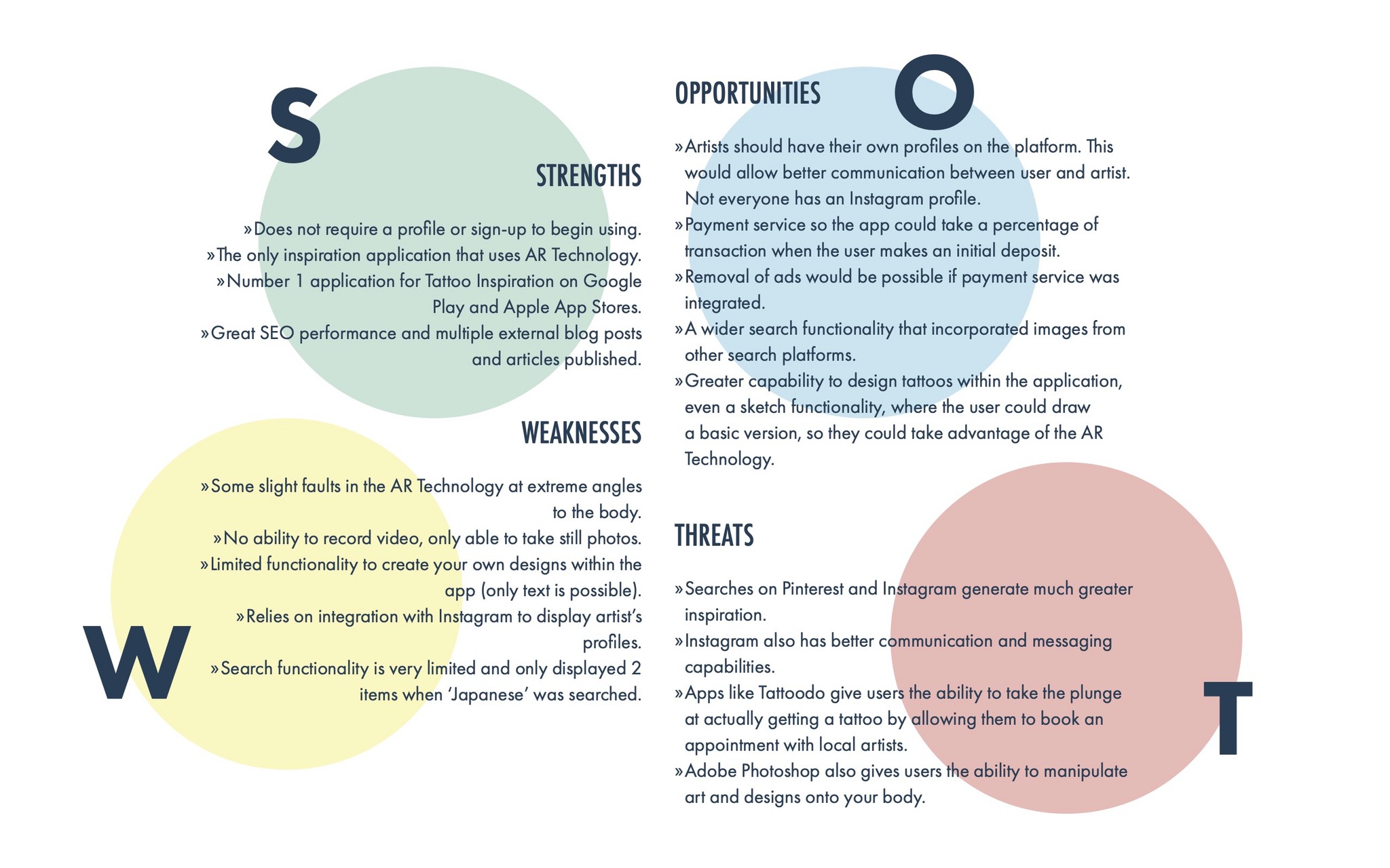
I capitalised on the research by carrying out a SWOT Analysis to fully understand the breadth of each application and how they set themselves apart in the market.
Common features that helped me to better navigate my experience was a 'Projects' tab and also the "Augmented Reality' feature of Ink Hunter.
I capitalised on the research by carrying out a SWOT Analysis to fully understand the breadth of each application and how they set themselves apart in the market.
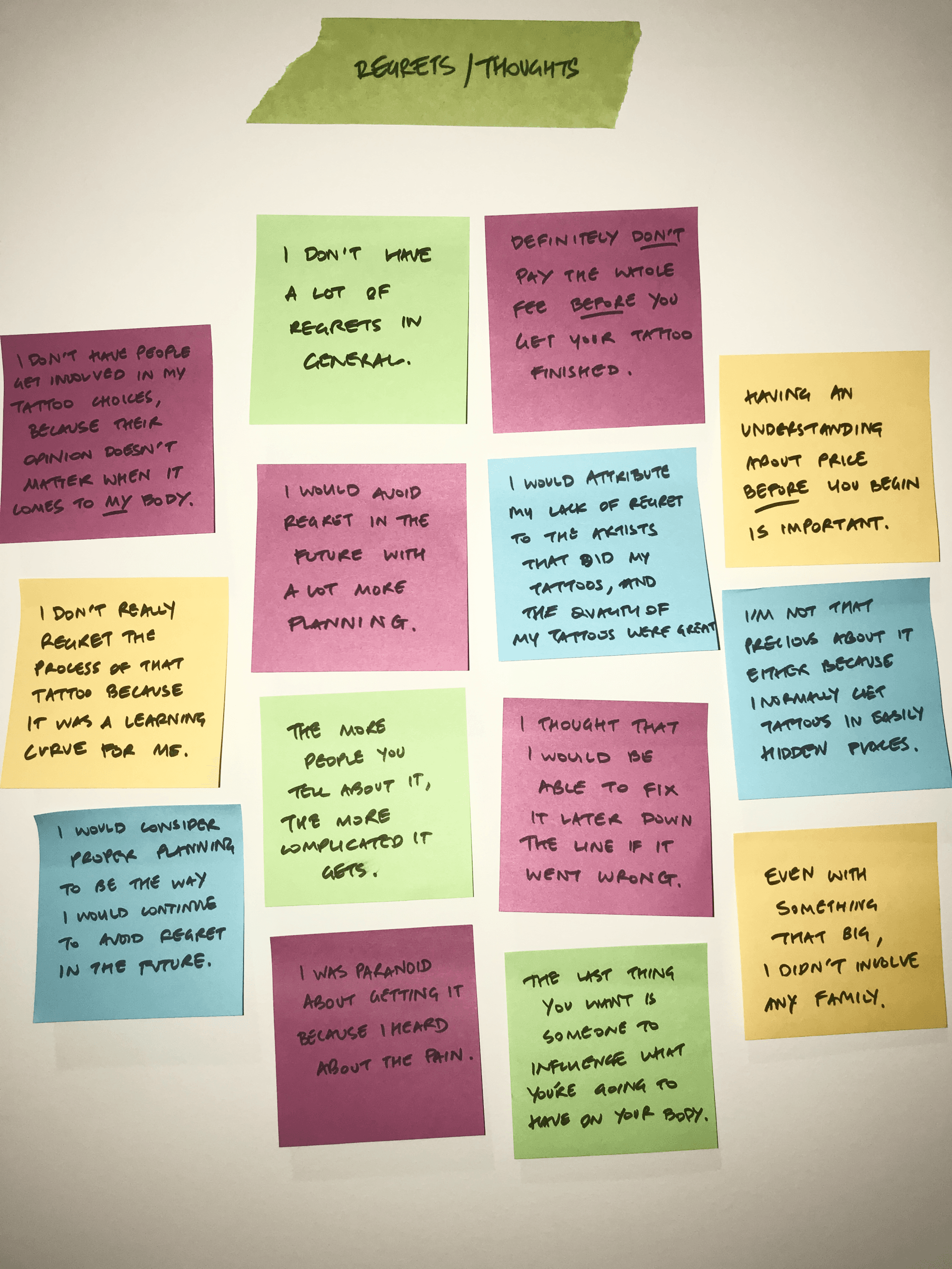
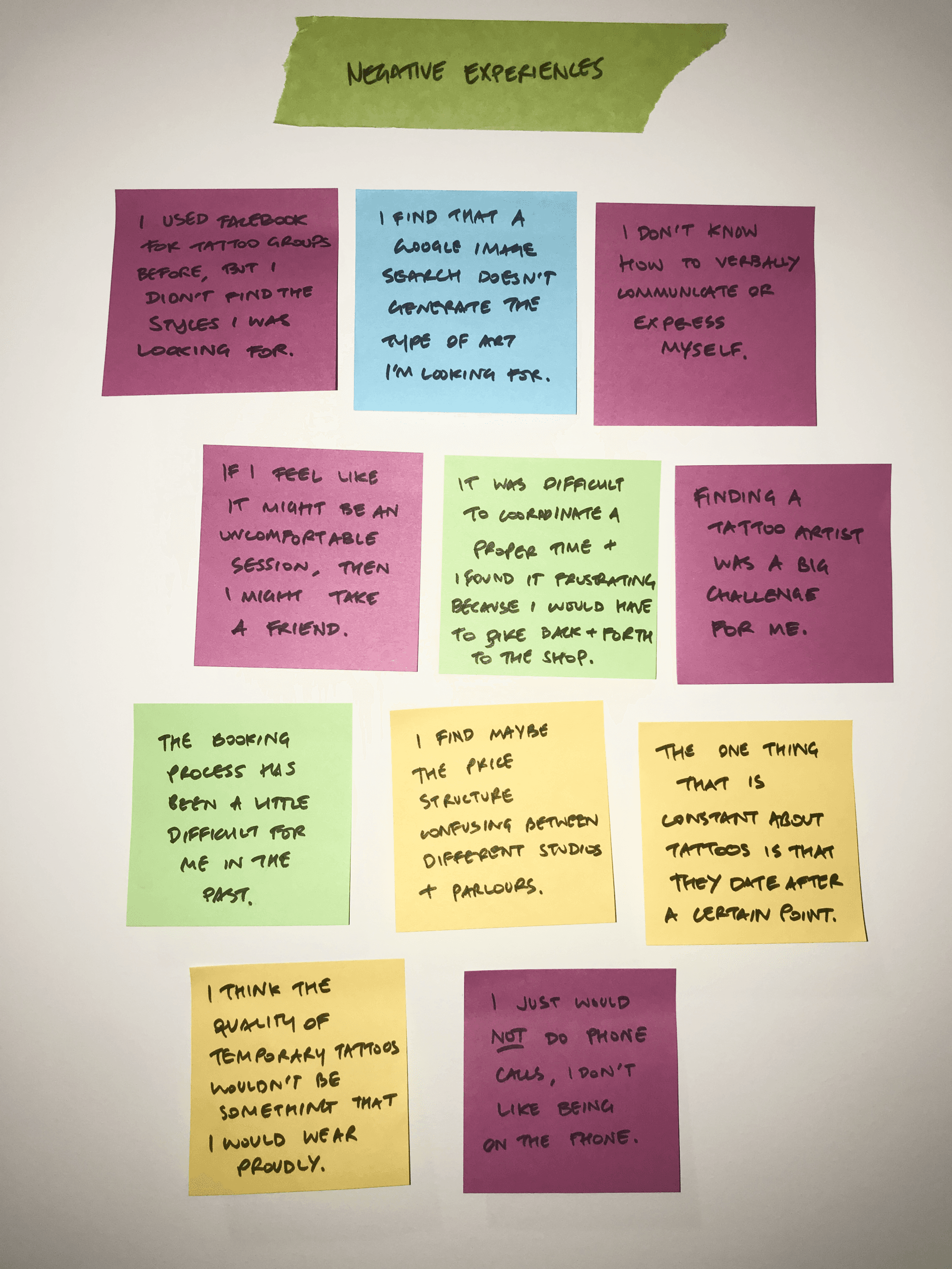
What does a positive experience look like?
The second part of the research process involved tapping into the experiences of others to gauge how their involvement in getting a tattoo could best inform a positive experience for the future user of this application.
I interviewed 4 participants from 3 countries, each with various tattoo experience to ensure I get a broader image of the typical start-to-finish when someone sets out to get inked.
l identified 3 key insights as a result of the interview process and used them to inform my design decisions moving forward.

#1
The majority of bad experiences stemmed from poor planning or communication issues between the artist and themselves. There needs to be a better way to communicate with artists and give users the confidence that they were the one.

#2
Geo-location features on inspiration helped users to select their preferred artist. I saw this as a great way to incorporate a filtering feature on the inspiration so all of the images the user is viewing are based on their preferred location.

#3
Getting a tattoo is a deeply personal experience, and they generally do not involve the opinions of friends and family. This insight allowed me to remove a feature involving 'polling' that I had planned on implementing within the design.

Defining the User
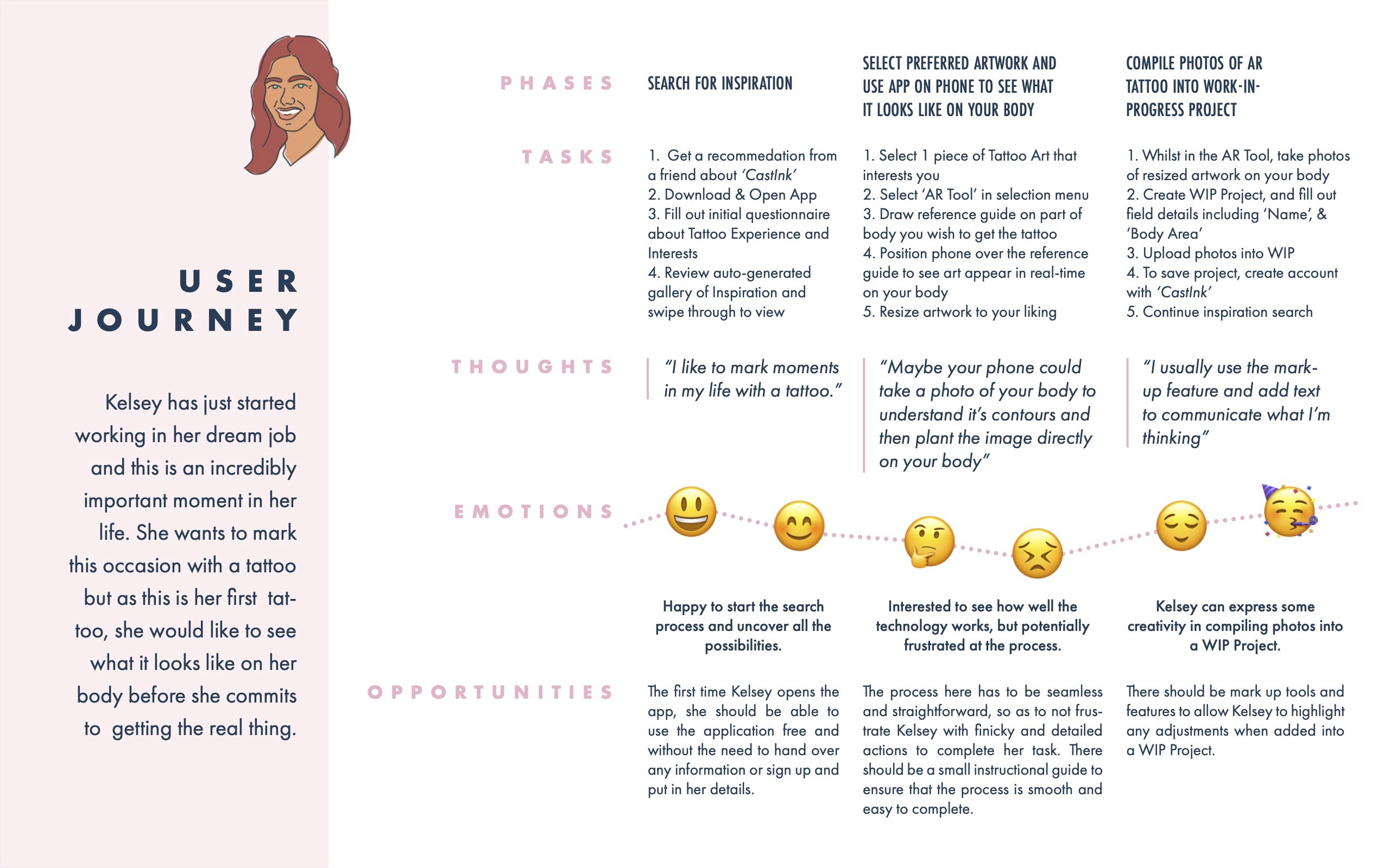
The insights from the user research guided the formation of 2 User Personas, giving me the ability to focus my design decision on feasible, realistic individuals.
Defining the User
The insights from the user research guided the formation of 2 User Personas, giving me the ability to focus my design decision on feasible, realistic individuals.
The diverging and broad thinking ideas of the research phase now converged into a thorough strategy that allowed me to attack the concerns of the interview participants.
The diverging and broad thinking ideas of the research phase now converged into a thorough strategy that allowed me to attack the concerns of the interview participants.
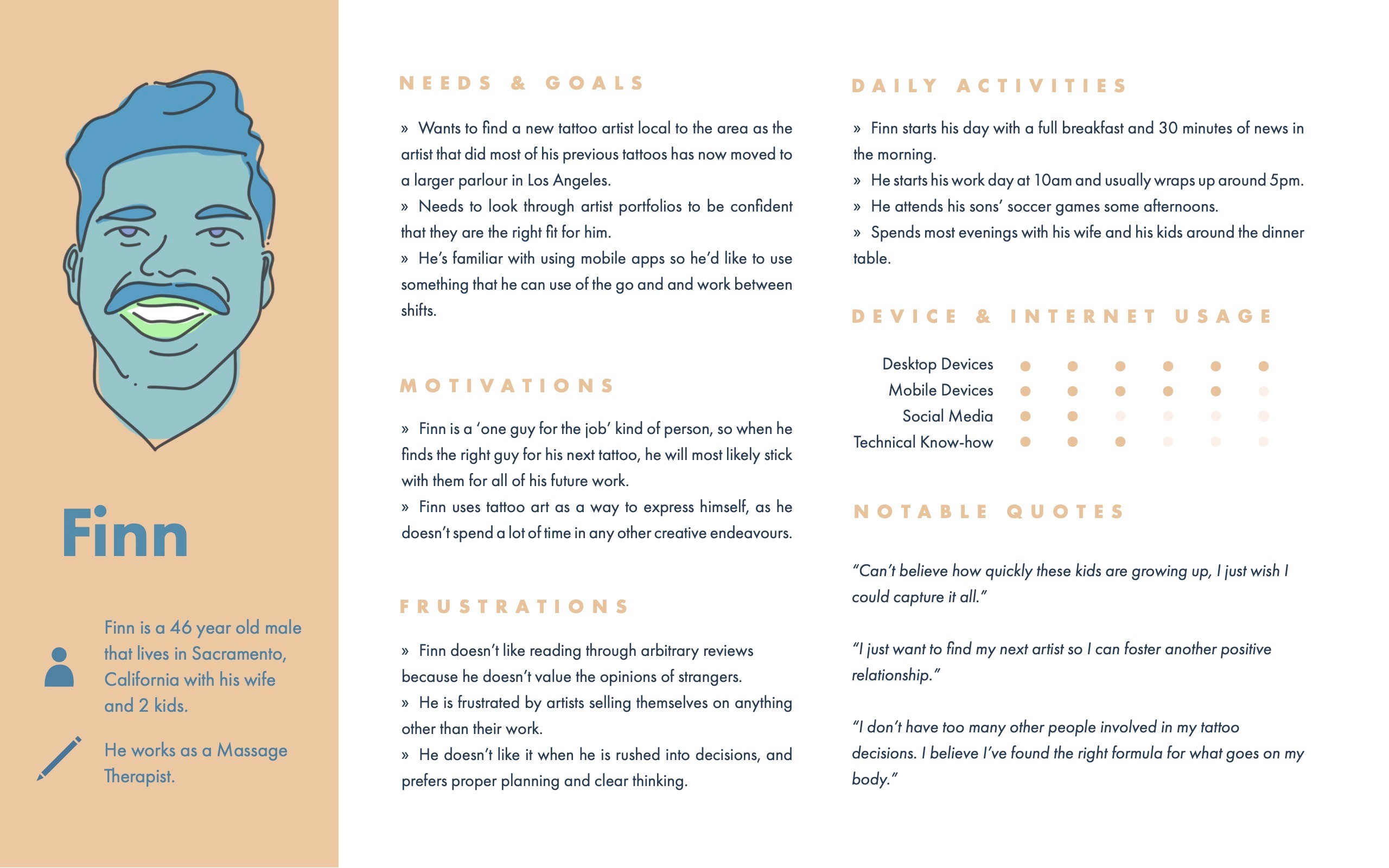


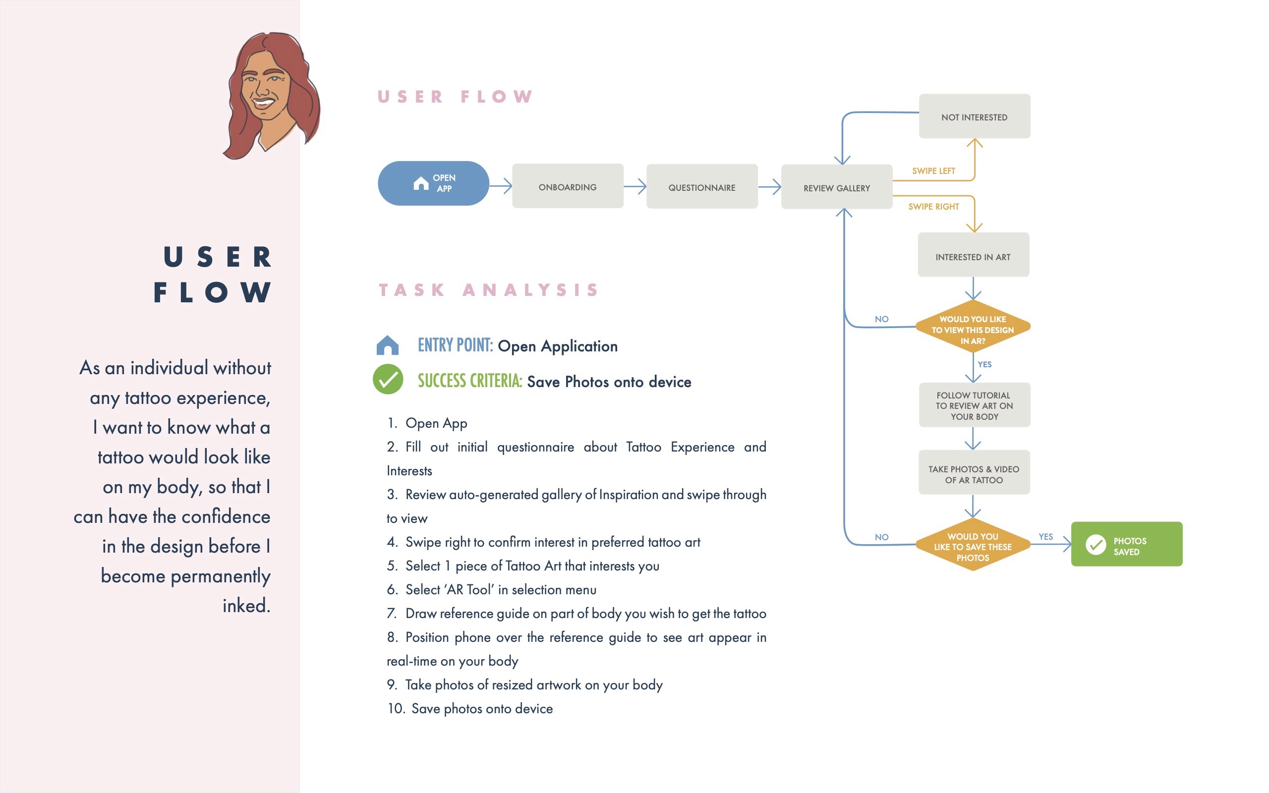
The personas needed to be fleshed out further, through the exploration of their mental models and a task analysis. This exercise taught me how the personas would work their way through this application, and ultimately achieve their set goals.
The user flow diagram was the first time I was able to visualise the cause-and-effect of the persona's actions in a semi-linear fashion, clarifying their goals and providing clear direction to develop the application's architecture.
"I need to find an artist with a specific style, because that's how you know your tattoo will be done to the best ability”
"I need to find an artist with a specific style, because that's how you know your tattoo will be done to the best ability”
Organising the chaos
The application's features were directly informed through the user research and the task analysis, and then organised into a succinct architecture through the exercise of a card sort, involving 9 participants.
Organising the chaos
The application's features were directly informed through the user research and the task analysis, and then organised into a succinct architecture through the exercise of a card sort, involving 9 participants.
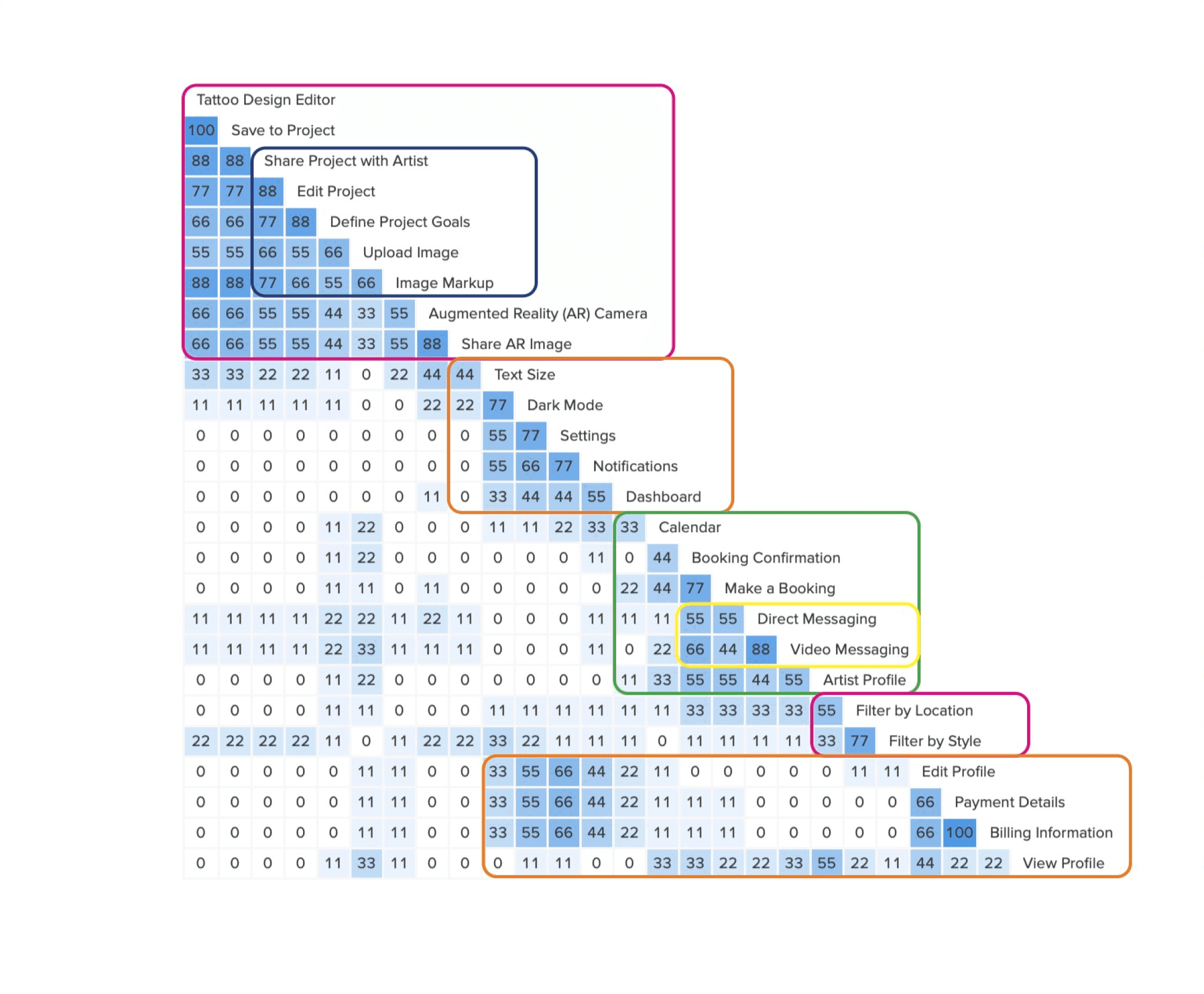

This second revision of the site map ends up being the penultimate version, being finalised for a cleaner, more streamlined version of the one pictured above.
This second revision of the site map ends up being the penultimate version, being finalised for a cleaner, more streamlined version of the one pictured above.
This version did however showcase how the features didn't just sit side-by-side, but the intention of the relationships between each of the features. The Appointments and the Messaging features are inter-related, similarly with the Projects and Search features via the Augmented Reality Camera.
This version did however showcase how the features didn't just sit side-by-side, but the intention of the relationships between each of the features. The Appointments and the Messaging features are inter-related, similarly with the Projects and Search features via the Augmented Reality Camera.

Designing for action
The site map was resolved through wire framing and prototyping, and ultimately through iterating after user testing. It was further developed via a mobile-first design plan which kept me focussed initially on a minimum viable product and later enhanced through prototyping Adobe XD.
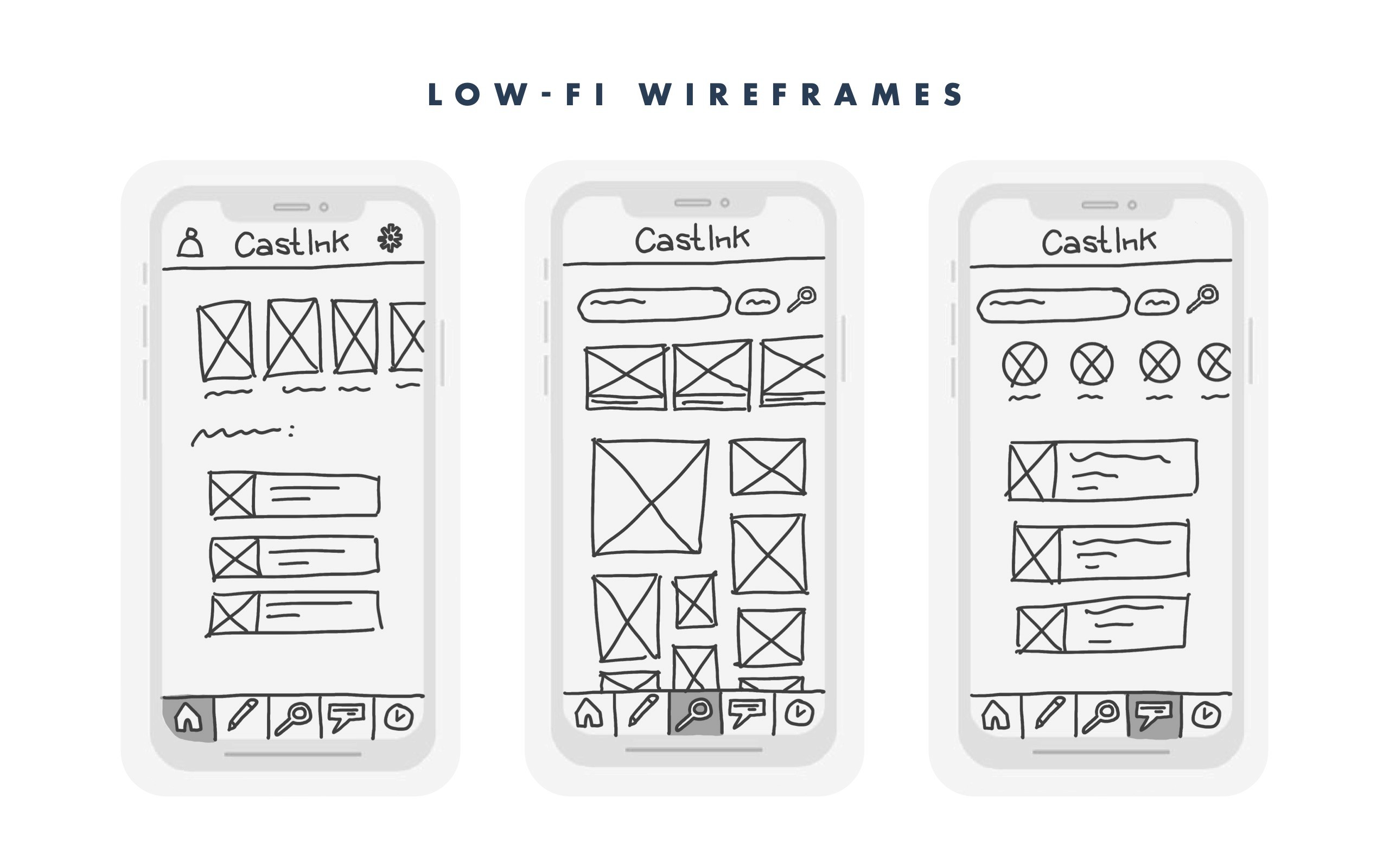


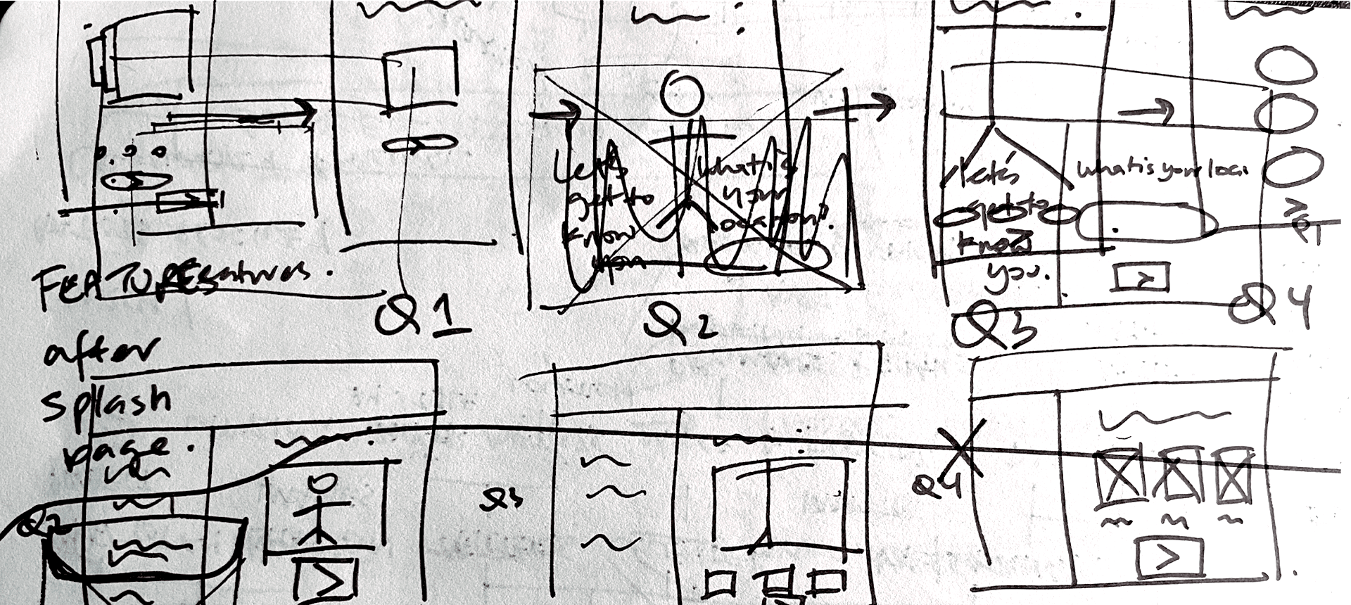
The wireframes developed from sketches to Adobe XD quite quickly. It was best to develop the wireframes in the program that it would ultimately be built in, so I wanted to work within the constraints of Adobe XD to facilitate steeper progress.
The wireframes developed from sketches to Adobe XD quite quickly. It was best to develop the wireframes in the program that it would ultimately be built in, so I wanted to work within the constraints of Adobe XD to facilitate steeper progress.
The final prototype prior to testing was an extension of the questions I set out to answer during the research and discover phase of this process. It set the stage upon which questions like "what positive experiences look like" could be verified, and also how quickly a user might be able to convert from a jittery and nervous newbie to one with confidence to proceed to the next stage.
The final prototype prior to testing was an extension of the questions I set out to answer during the research and discover phase of this process. It set the stage upon which questions like "what positive experiences look like" could be verified, and also how quickly a user might be able to convert from a jittery and nervous newbie to one with confidence to proceed to the next stage.

Discovering the cracks
A Usability Test Plan was created prior to conducting the first sessions which brought together 6 participants from 4 countries, undertaken over 4 days in January 2021. 4 out the 6 sessions were moderated remotely via Zoom.
Discovering the cracks
A Usability Test Plan was created prior to conducting the first sessions which brought together 6 participants from 4 countries, undertaken over 4 days in January 2021. 4 out the 6 sessions were moderated remotely via Zoom.
Goals
The goal is to evaluate the efficacy of the current clickable prototype and understand all pain points and usability issues that participants experience.
Goals
The goal is to evaluate the efficacy of the current clickable prototype and understand all pain points and usability issues that participants experience.
Takeaways
I learnt that it was important to maintain a certain distance when it came to the participant making mistakes because it was a learning moment for me.
After testing this iteration with participants, l repeatedly observed 4 common issues that needed to be addressed in the next iteration:
Takeaways
I learnt that it was important to maintain a certain distance when it came to the participant making mistakes because it was a learning moment for me.
After testing this iteration with participants, l repeatedly observed 4 common issues that needed to be addressed in the next iteration:
Objectives
I set myself some objectives to evaluate the results against. These were questions I had raised to myself during the prototyping phase, as I began to design for the user and not just on my own instincts.
How quickly can users engage in the application to begin the task?
Will users choose to engage with the onboarding process or skip directly to the dashboard?
Will users understand that if they complete the onboarding process, they have started their first project?
Is the AR Camera functionality intuitive enough for users?
Will users understand the difference between the Dashboard and the Projects Tab?
Observe the efficacy of the prototype's navigation.

Before
100% of participants found the text far too small to read without moving their head closer to the screen, or zooming in on the browser.

After
Increase the size of the text in the navigation bar, the subtext and the text in the coach marks. The global navigation increased from opt to 9pt.
Before
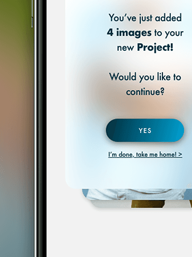
66% of the participants found it difficult to proceed onto the Projects Page from the Curated Gallery. One participant cycled through 15 images before realising the 'Done' button below the gallery.
After
Insert a blank card in the Gallery that appears after 4 images have been swiped, asking whether the user wants to continue swiping, or proceed onto the Projects Page.

Before
33% of the participants weren't able to immediately identify the position of the AR Button for the image they wanted to try on.
Before
33% of the participants weren't able to immediately identify the position of the AR Button for the image they wanted to try on.

After
Remove any additional buttons on the image that aren't important & centre the AR Button. Put it within a clickable button to match the rest of the Ul.

Before
80% of participants had mentioned that they do not see how drawing on the 3D Model contributes to the overall experience of the Curated Gallery.
Before
80% of participants had mentioned that they do not see how drawing on the 3D Model contributes to the overall experience of the Curated Gallery.
After
Remove this step and streamline the onboarding process removing unnecessary clicks. The body part should animate to confirm.
After
Remove this step and streamline the onboarding process & remove unnecessary clicks. The body part should animate to confirm.

Final thoughts
In the 7 months since beginning this project, the design has evolved from a scattered and complicated architecture to a concise and journey-driven model that aims to meet the needs of the user by tailoring their experience for action.
The process has taught me to have appreciation for the testing and feedback I receive as that is what allows for steeper growth and development. It is more important to test as changes are made than waiting until the polished product.
Hey I'm Pasindu.
🏃🏾♂️
🌶️
🏀


